Save pyexcel data as svg chart
Line
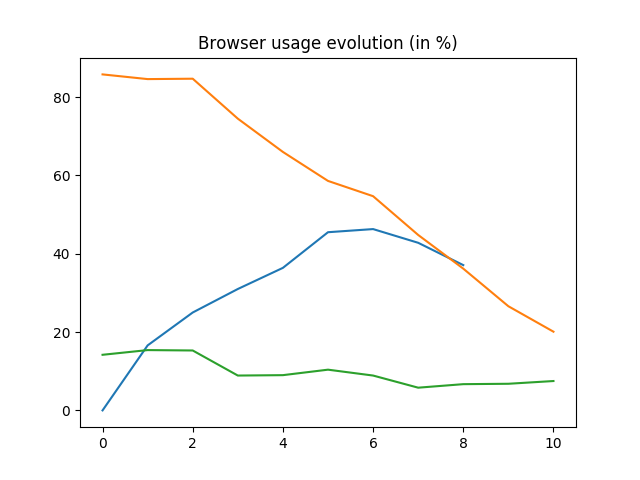
Here is the source code using pyexcel:
title = 'Browser usage evolution (in %)'
x_labels = map(str, range(2002, 2013))
data = {
    'Firefox': [None, None, 0, 16.6, 25, 31, 36.4, 45.5, 46.3, 42.8, 37.1],
    'Chrome': [None, None, None, None, None, None, 0, 3.9, 10.8, 23.8, 35.3],  # flake8: noqa
    'IE': [85.8, 84.6, 84.7, 74.5, 66, 58.6, 54.7, 44.8, 36.2, 26.6, 20.1],
    'Others': [14.2, 15.4, 15.3, 8.9, 9, 10.4, 8.9, 5.8, 6.7, 6.8, 7.5]
}
pe.save_as(
    adict=data,
    dest_title=title,
    dest_x_labels=x_labels,
    dest_chart_type='line',
    dest_file_name='line.png',
)
Histogram
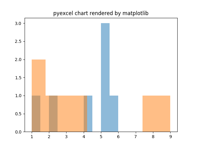
Here is the source code using pyexcel:
sheet_name = 'Wide bars'
data = [[5, 5, 2, 1, 4, 5, 6],
        [1, 1, 2, 3, 4, 8, 9]]
pe.save_as(
    array=data,
    sheet_name=sheet_name,
    dest_chart_type='histogram',
    dest_file_name='histogram.png',
    dest_alpha=0.5
Single histogram
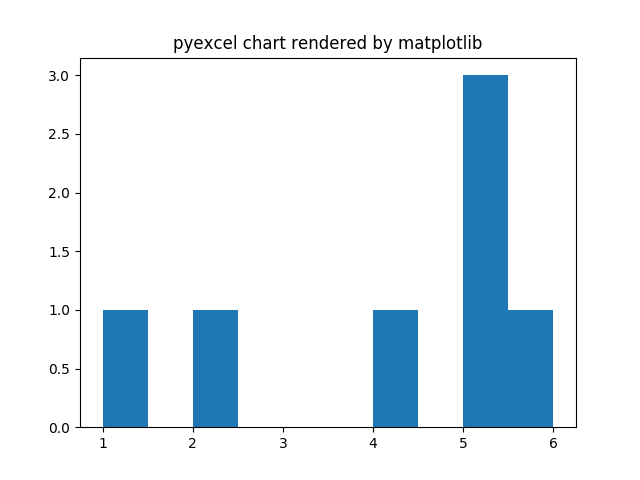
Here is the source code to draw single sheet histogram:
sheet_name = 'Wide bars'
data = [[5, 5, 2, 1, 4, 5, 6]]
pe.save_as(
    array=data,
    sheet_name=sheet_name,
    dest_chart_type='histogram',
    dest_file_name='single_histogram.png',
)
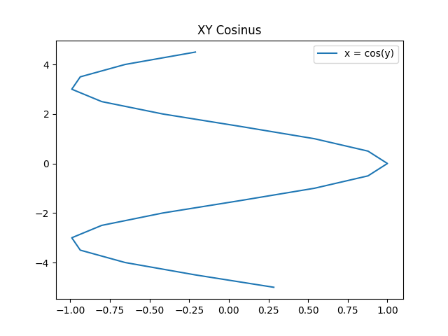
XY
BASIC
Basic XY Lines, drawing cosinus:
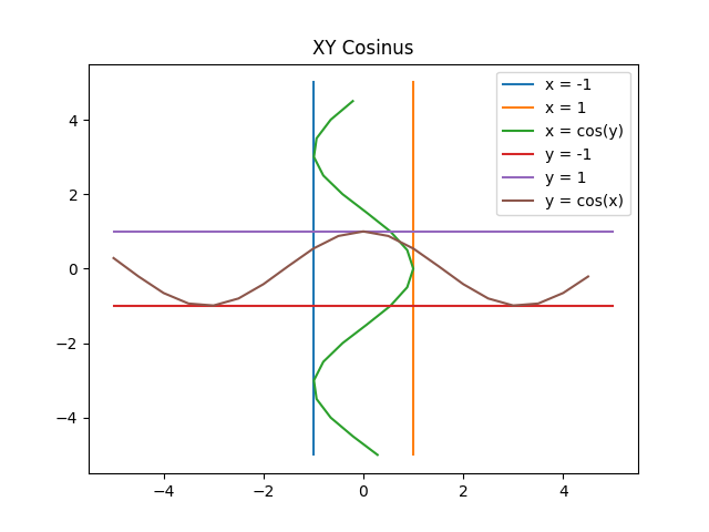
Here is the source code using pyexcel:
from math import cos
data = {
    'x = cos(y)': [(cos(x / 10.), x / 10.) for x in range(-50, 50, 5)],
    'y = cos(x)': [(x / 10., cos(x / 10.)) for x in range(-50, 50, 5)],
    'x = 1':  [(1, -5), (1, 5)],
    'x = -1': [(-1, -5), (-1, 5)],
    'y = 1':  [(-5, 1), (5, 1)],
    'y = -1': [(-5, -1), (5, -1)]
}
pe.save_book_as(
    bookdict=data,
    dest_chart_type='xy',
    dest_title='XY Cosinus',
    dest_file_name='xy_cosinus.png',
)
Single xy line
Here is the source code to draw single sheet histogram:
from math import cos
sheet_name = 'x = cos(y)'
data = [(cos(x / 10.), x / 10.) for x in range(-50, 50, 5)]
pe.save_as(
    array=data,
    sheet_name=sheet_name,
    dest_chart_type='xy',
    dest_title='XY Cosinus',
    dest_file_name='single_xy_cosinus.png',
)
Pie chart
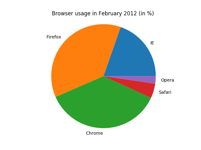
Here is the source code using pyexcel:
title = 'Browser usage in February 2012 (in %)'
data = OrderedDict()
data['IE'] = [19.5]
data['Firefox'] = [36.6]
data['Chrome'] = [36.3]
data['Safari'] = [4.5]
data['Opera'] = [2.3]
pe.save_as(
    adict=data,
    dest_title=title,
    dest_chart_type='pie',
    dest_file_name='pie.png'
)
Radar chart

Here is the source code using pyexcel:
    array=data,
    sheet_name=sheet_name,
    dest_chart_type='histogram',
    dest_file_name='single_histogram.png',
)
_validate_and_remove('single_histogram.png')


test_histogram():
sheet_name = 'Wide bars'
data = [[5, 5, 2, 1, 4, 5, 6],
        [1, 1, 2, 3, 4, 8, 9]]
pe.save_as(
    array=data,
    sheet_name=sheet_name,
    dest_chart_type='histogram',
    dest_file_name='histogram.png',
    dest_alpha=0.5
Box chart

Here is the source code using pyexcel:
_validate_and_remove(file_name):
from filecmp import cmp
status = cmp(file_name, _fixture_file(file_name))
assert status is True
os.unlink(file_name)


_get_svg_graph_element(file_name):
import lxml.etree as etree

svg = etree.parse(file_name)
root = svg.getroot()
g = root.find('.//g', namespaces=root.nsmap)
Dot chart

Here is the source code using pyexcel:
_fixture_file(file_name):
return os.path.join("docs", "source", "_static", file_name)
